
Feature Spotlight: Data Visualizer Deep dive (New functionality and tips & tricks)
Explore practical Data Visualizer features for building clearer charts, pivot tables, data-quality views, and interactive dashboards in DHIS2.
Aller à une section de cette page
Webinar recording
Session outline
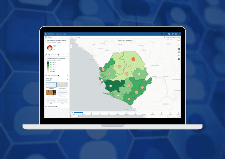
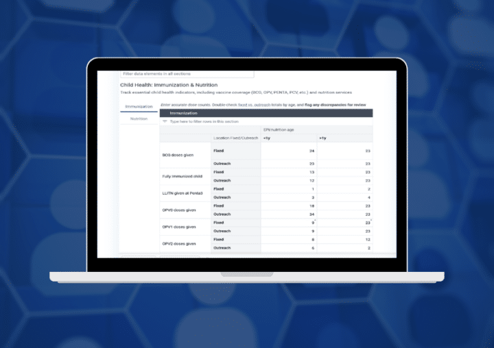
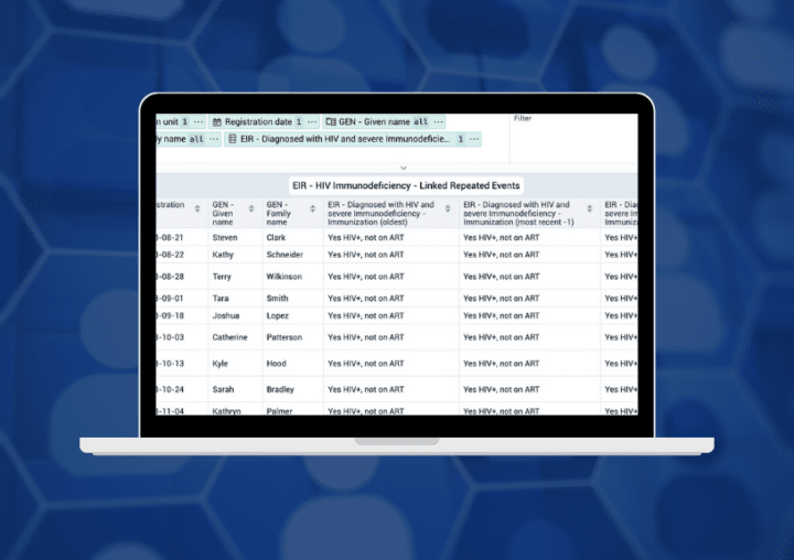
This video is part of the DHIS2 feature spotlight webinar series and provides a deep dive into new and lesser-known Data Visualizer functionality. It covers outlier charts, cumulative values and fixed headers in pivot tables, combination charts with multiple axes, data-item metadata, option-set and program-indicator disaggregation, and dashboard slideshow autoplay. The session also demonstrates practical tips for improving data exploration, troubleshooting, visualization, and dashboard reporting while reducing the need for large numbers of program indicators.
Supporting resources
For further reading and hands-on guidance, check out the documentation: