The DHIS2 Annual Conference takes place from 15-18 June 2026! Learn more
DHIS 2.36 Overview
DHIS2 version 2.36 is out with many new features, improvements and bug fixes. On this page you can find information on this software version, including feature descriptions, links to technical documentation, and more
Jump to a section on this page
Feature Demo Videos
Discover some highlights of new features in this DHIS2 release with feature demonstrations by DHIS2 experts.
Analytics Features
Scatter plots
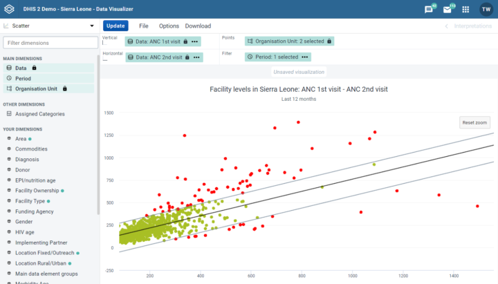
The data visualizer app now features scatter plots. This enables users to chart organisation units as points against two variables for a single period with scatter plots.
- Zoom in by clicking and dragging the cursor over an area you would like to zoom in on. This is often necessary to see more detail in areas where many organisation units are clustered together.
- Outlier detection can be done using either a standard z-score, modified z-score, or an interquartile range via the options menu. An extreme vertical (y-axis) and horizontal (x-axis) threshold line can also be applied. Endorsed by the WHO, this is a very clear and powerful way to identify outliers that often represent data quality issues. You can identify the outliers that are most likely to throw off national statistics by using the outlier detection in combination with the extreme X and Y threshold lines.
Video | Screenshot 1 | Screenshot 2 | Screenshot 3 | Docs
Population maps from Google Earth Engine
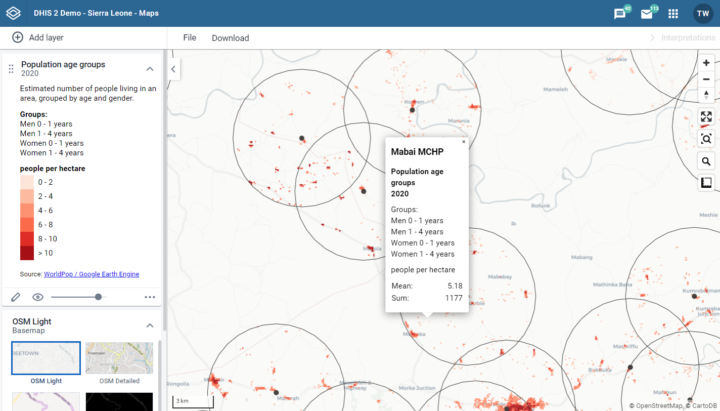
Many DHIS2 instances suffer from not having accurate population data. This feature allows you to build maps with data from Google Earth Engine including the latest World Pop population estimates. You can apply a boundary layer to visualize the population values, density by hectare and average by hectare for organisational units. You can apply a buffer around a facility to see the population that falls within the buffer. Population dataset are available for age and sex disaggregation. This is useful in areas where census data is incomplete or unreliable, e.g. for planning outreach campaigns and estimating risk of disease transmission.
Video | Screenshot 1 | Screenshot 2 | Screenshot 3 | Docs
Mobile-friendly dashboard app
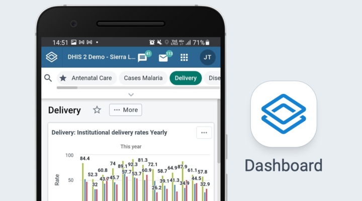
The dashboard web app is now more mobile-friendly and is more usable on mobile devices. This allows you to use the power of dashboards from your mobile device. Now you can take your dashboards with you, check them any time, and share data with anyone you need from the convenience of your phone. The app has adopted several of the principles of Progressive Web Apps (PWA). Offline support to dashboards will come a in future release.
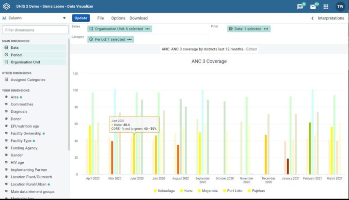
Bar and column chart legends
The data visualizer app now lets you change the color of a bar or column based upon a predefined legend. This makes it easy to highlight under and over-performance with bar and column charts.
Video | Screenshot 1 | Screenshot 2 | Docs
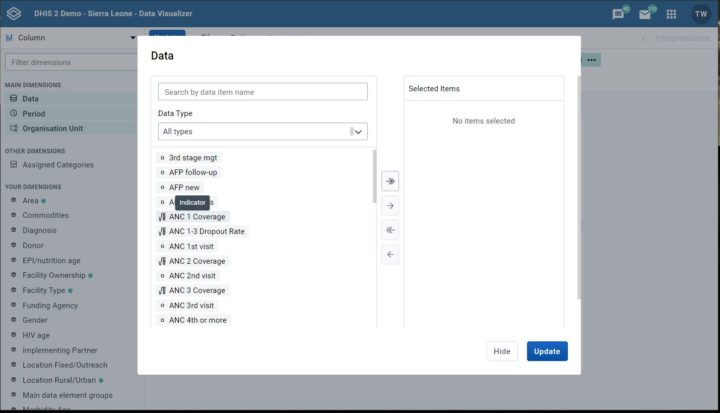
Universal data item search
The data visualizer app now supports search for data items across all types, making it much easier to find the data items you want across indicators, data elements, data sets, program data elements and program indicators. All you need to do is search for the data item and all matches will be displayed irrespective of data item type. You can still narrow down your search from the type selection.
Video | Screenshot | Docs
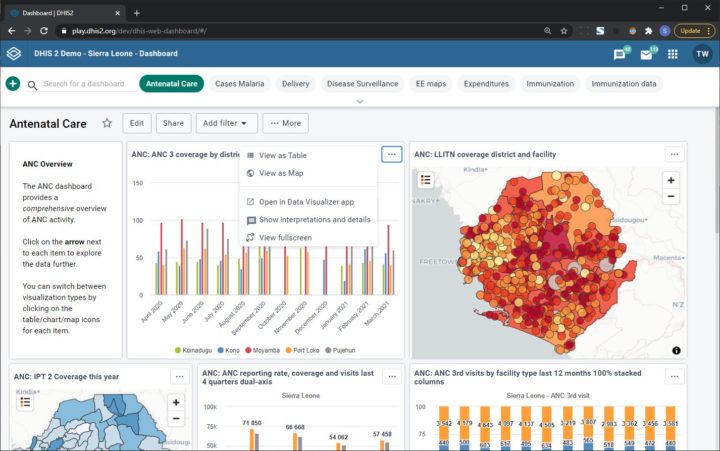
Full screen dashboard item presentation mode
In the dashboard app, expand any dashboard item (chart, map, or pivot table) to the size of the entire screen. This is great for presenting data in virtual or in-person meetings directly from the dashboard.
Video | Screenshot | Docs
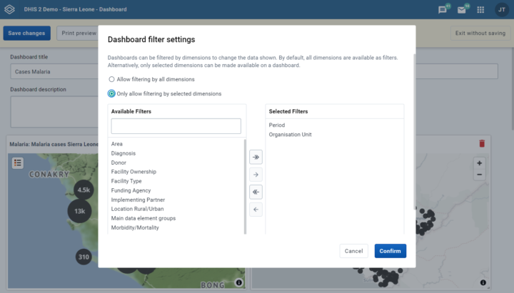
Dashboard filter settings
Dashboard owners can now define which filters to make available for each dashboard. Often a large number of data dimensions exists and not all of them apply to the data in a specific dashboard. This makes it hard to find and select relevant data dimension. By defining exactly which data dimensions become available for a dashboard, the user experience is simplified and made more engaging. Go to Edit > Filter settings to select filters.
Video | Screenshot | Screenshot 2 | Docs
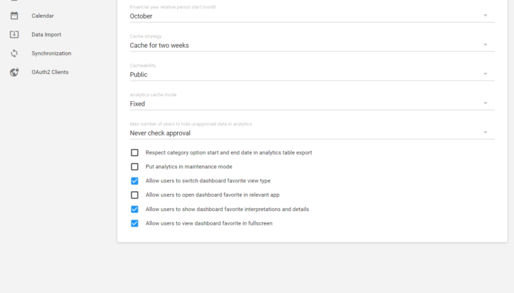
Visualization type for dashboard items
Countries and projects work hard to design dashboards that tell a specific story, where the visualization type (maps, charts or tables) is carefully selected and optimized. In previous versions a user can change the visualization type of each dashboard item to a table, map or chart. In some cases, this may undermine the carefully crafted story the dashboard owner is trying to communicate. New system settings are now available in the Analytics section of the settings app for controlling whether to allow users to switch visualization type, open items in the visualizer app, view interpretations and view in full screen.
Video | Screenshot | Docs
Tracker and Event Features
Performance improvements
A huge number of performance improvements got included in 2.36 and there are broad improvements to tracker performance, in particular around database query optimizations. The improvements are leading to lower response times, faster database queries and less memory consumption. Most of these updates have been applied to versions 2.34.4, 2.35.2 and 2.36.0. Large scale DHIS2 implementations are advised to upgrade.

Tracker functionality in Capture app
The capture app now has more support for tracker programs than before. Users will now be able to list and interact with tracked entity instances much in the same way as events, and will have access to searching and registering/enrolling tracked entity instances in the Capture app itself. Further interaction with enrollments and events in enrollments will in 2.36 still take place in the Tracker Capture app, but navigation between the apps will happen seamlessly. This will allow data entry user to access tracker and event data in the same place, and have a more integrated workflow.
Video | Screenshot 1 | 2 | 3 | 4
New endpoint for importing tracker data
A new API for tracker data is now released side by side with the existing API. The new API is redesigned and reimplemented from the bottom up with a new architecture. The new implementation is more maintainable and yields a bigger potential for performance enhancements than it was possible to achieve in the old code base. The new API will run a full program rule execution, and allows server side field assignment and payload validation in addition to the existing functionality for sending messages. The new API is going to take the place of the existing one in later versions of DHIS2, but is released side by side at this time to allow app developers to start integration processes.
New endpoint for retrieving tracker data
A new API for retrieving tracker data is now released with the new endpoint for importing tracker data. This new API allows downloading tracker data on the same format as the new endpoint for importing data uses, making it easier to integrate with this new set of services.
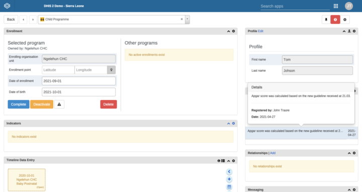
Full name shown in notes
In tracker capture, the full name is now shown for the user that entered a note/comment. Previously, only the username was shown. The full name is useful in cases where the username is not readable.
Video | Screenshot | Jira
Platform Features
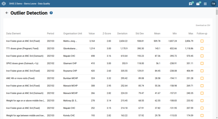
Outlier detection
A new and improved outlier detection is available in the data quality app. Outlier values are now ranked and the most significant outlier are returned first, making it lot easier to find and correct the outlier values which most significantly affect your data analysis. Previously, outliers were returned without any order. Outliers are ranked by absolute distance from mean. The z-score of the value, as well as mean, std dev, min and max are available in the response. The new solution is more scalable, allowing you to search across a larger data set.
Video | Screenshot 1 | Screenshot 2 | User docs | API docs
OpenID Connect
The OpenID Connect (OIDC) support is greatly improved. A generic solution is now available which will work with most OIDC providers. Specific providers for Azure and WSO2 are also added. Providers which have been tested and verified to work are Google, Microsoft/Azure, Okta, Keykloak and WSO2. OIDC allows for Single Sign-On across multiple systems while managing identities in a central location. OIDC is useful for Single Sign-On across multiple systems.
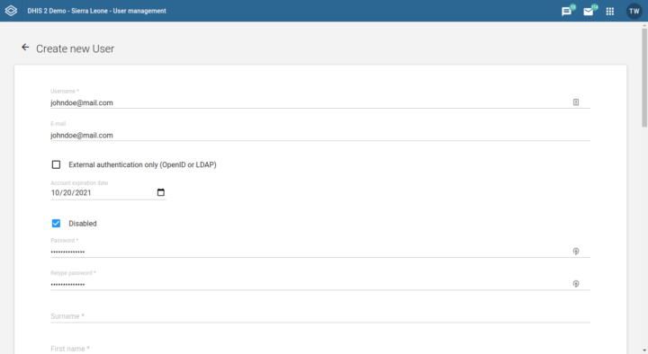
User account expiration
User accounts can now be set to expire on a particular date. This is useful for creating temporary accounts, e.g. when inviting partners through guest accounts.
Video | Screenshot | Docs | Jira
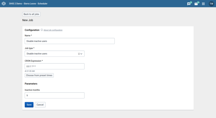
Disable inactive users
A new system job is available for automatically disable users which have been inactive (not logged in) for a given number of months. This is useful from a security perspective to prevent inactive user accounts from being compromised.
Video | Screenshot | Docs
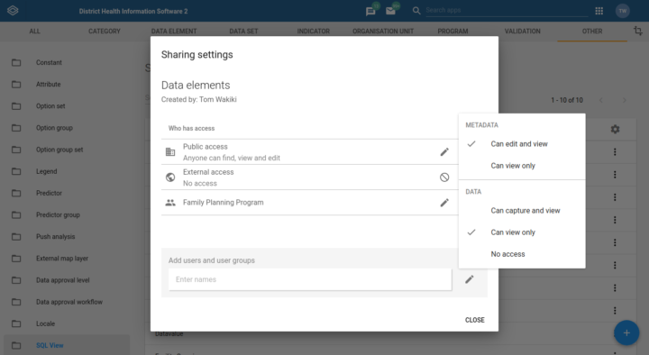
Data read sharing for SQL views
Data read sharing is now required to read the output of an SQL view. This allows implementers to grant users access to read the output of SQL views without giving access to add or edit the views.
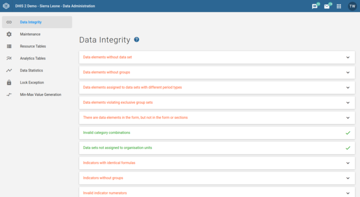
Data integrity checks performance
The performance of the data integrity checks (in the data administration app) has been improved and completes a lot faster.
Video | Screenshot | Docs
Core application modernization
The majority of core applications bundled with this release have been upgraded to leverage the latest DHIS2 application platform and suite of tools. This ensures that modernized apps have identical header bar, improved translation coverage and more standardized user interface elements.
API Features
Android Compatibility
This version of the DHIS2 core software is fully compatible with the DHIS2 Android Capture App version 2.4.
Release Information
Click on the links in the table below for more information about this software release and to access an interactive demo. You can also add comments or ask questions about this release on the DHIS2 Community of Practice.
| To find more details about... | Follow this link: |
|---|---|
| Download release and sample database | Downloads |
| Documentation and Javadocs | Documentation |
| Upgrade notes | Upgrade notes on Github |
| Details about each feature on JIRA (requires login) | Details on JIRA |
| Overview of issues on JIRA (requires login) | Overview on JIRA |
| Source code on Github | DHIS2 source code |
| Demo instance | Demos |
| DHIS2 community | DHIS2 Community of Practice |
