
The DHIS2 Annual Conference takes place from 15-18 June 2026! Learn more

The DHIS2 Annual Conference takes place from 15-18 June 2026! Learn more
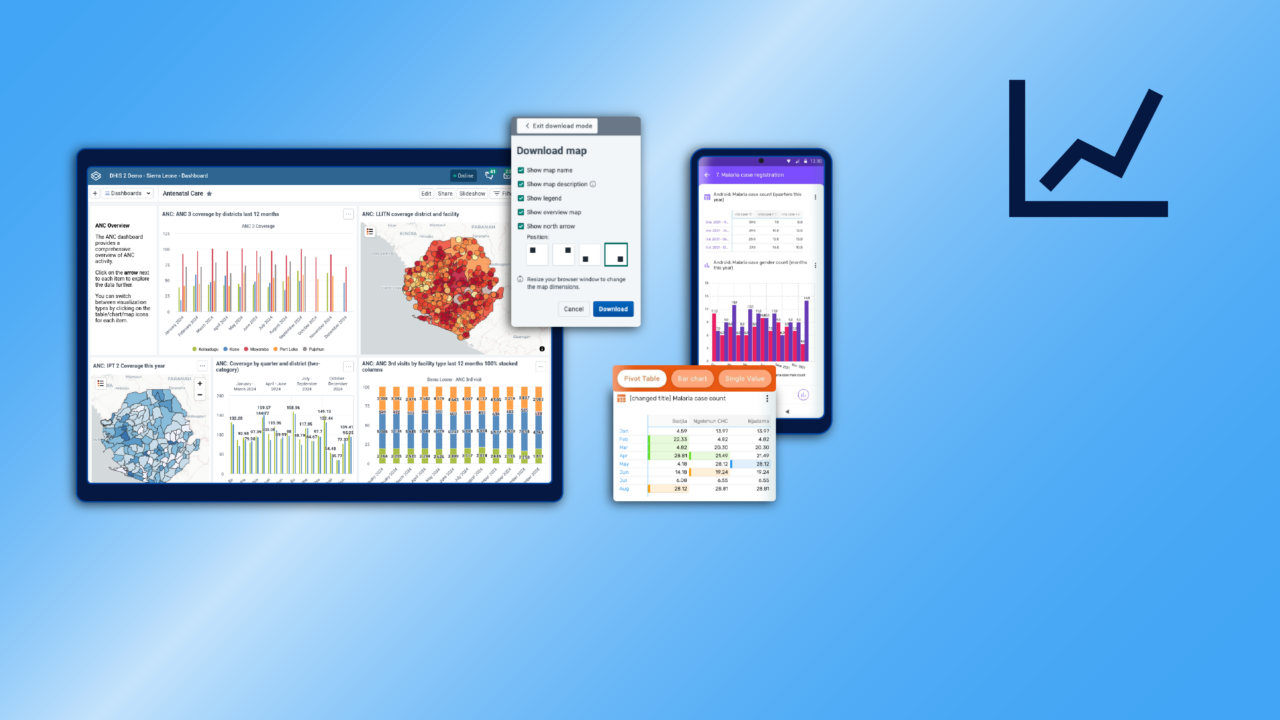
DHIS2 makes it easy to visualize and analyze your data using built-in tools, connect with other data analysis tools, and to share data outputs like charts, graphs, pivot tables, maps and dashboards to help inform decision making.
DHIS2 allows you to create your own indicators and analytics outputs that can be reused across your organization. You can use the indicator builder in the Maintenance app to define formulas that draw on your data in DHIS2 and other values to perform a large variety of calculations, like rates, counts, and much more. Indicators can be used in any data visualization, where they will provide data outputs that are updated dynamically. With DHIS2 metadata packages, you can also import preconfigured indicators for specific programs, making it easier to adhere to established reporting standards and best practices, and avoid reinventing the wheel.

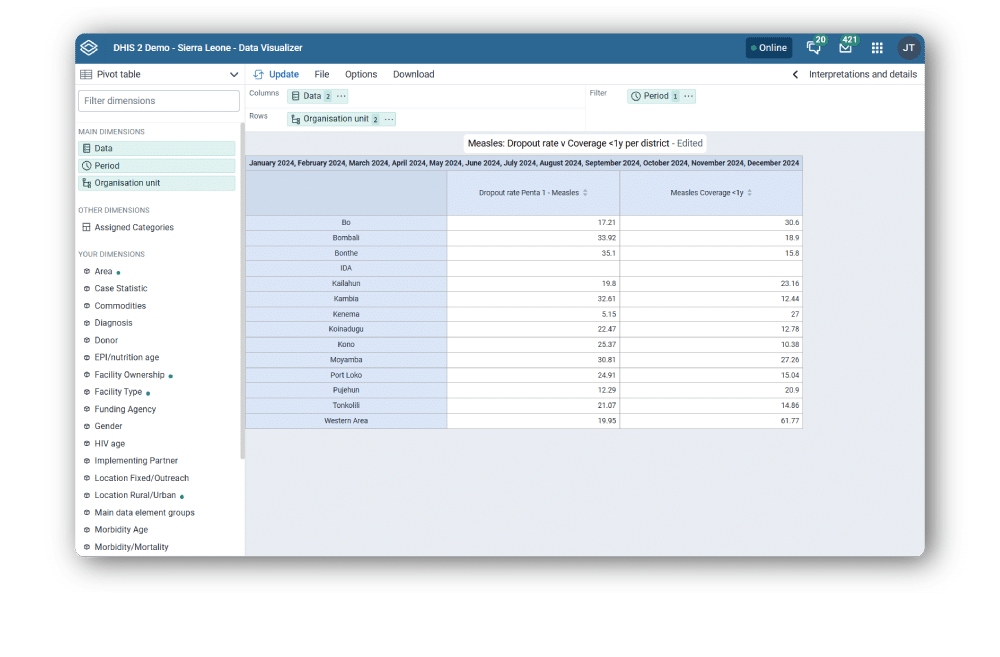
Through the DHIS2 Data Visualizer app, you can easily create and customize pivot tables that let you analyze data along all data dimensions and arrange these on columns, rows and as filters with a few simple mouse clicks. You can easily include totals and subtotals and remove empty rows, and modify the styling to get your pivot table looking how you want it, including applying automatic formatting to simplify analysis of large data sets and create easy-to-read scorecards. Pivot tables can be saved and added to dashboards, and they can also be downloaded and used as the basis for offline pivot tables in MS Excel or the software of your choice.
For individual-level data from Event and Tracker programs, you can use the Line Listing app to create customized, filterable lists of records that facilitate easier review of data, and which can be used as working lists for planning and follow up.
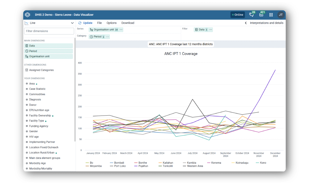
DHIS2 provides robust charting capabilities that can help you display your data effectively. The Data Visualizer app supports all standard chart types like column, line, pie, stacked column and area charts, as well as scatter plots, gauges, radar charts, and other specialized visualization types. You can combine chart types like line + bar into one visualization, and display trend lines, legends, titles, labels, target lines and baselines. Select easily from all of your indicators, organizational units, time periods and other dimensions, and flip categories and series around as you like. Charts can be saved and shared, added to dashboards, or downloaded as images and PDFs.
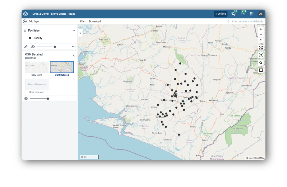
DHIS2 features powerful and easy-to-use web-based Geographic Information System (GIS) features through the built-in Maps app, which lets you do thematic mapping of areas and points, view facilities based on classifications, visualize catchment areas for each facility, and even geolocate unique entities or events, such as individual cases during a disease outbreak.
You can define custom legend sets and link them to indicators. The Maps app lets you put labels on areas and points and search and filter based on various criteria. You can calculate distance between points to facilitate planning. You can overlay multiple layers, use Bing Maps as background layer, and import other GIS-based data sets to allow for joint analysis with population, climate, and other data types. Maps can be saved and shared with other people, and added to your DHIS2 dashboard.
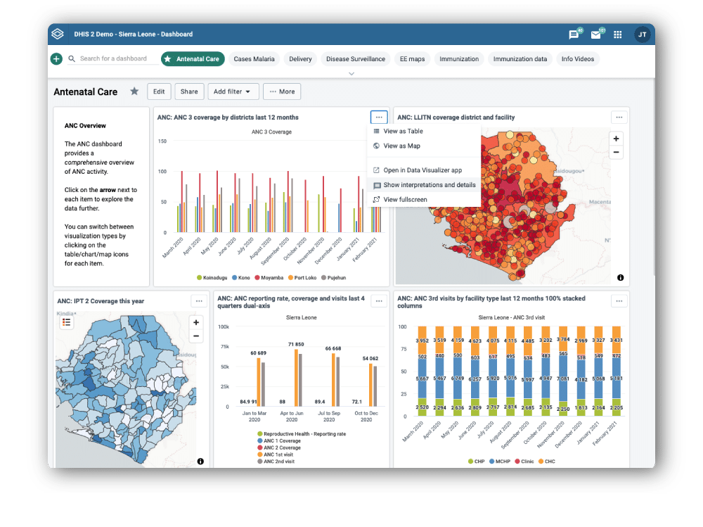
DHIS2 lets you create and save customized dashboards where you can put your favorite tables, charts, and maps in one place to get an overview of key data quickly, and add supporting text fields and other resources to help provide useful context for dashboard users. The DHIS2 Dashboard app gives you a truly dynamic dashboard experience. You can apply filters to slice your visualizations by time period, organisation unit, or custom data dimensions. You can change the visualization type of dashboard objects, switching between charts, maps, and pivot tables with a single click. You can also click on items in the dashboard to drill down into the data for more nuanced analysis, and open them directly in the Data Visualizer app to modify the underlying visualization if needed. You can use the autoplay feature to create an automatic slideshow of your dashboard visualizations. The Dashboard app also features integrated sharing and interpretation functionalities that let you share dashboards with specific users or groups and communicate directly with them about dashboard items, supporting collaborative analysis.
Organizations can configure standardized dashboards that can be accessed by users across a program or project team for collaborative analysis, presented to decision makers to provide a rapid overview of program status, printed or exported for use in presentations and reports, and even shared with the public. Dashboards can also be customized for specific user groups, ensuring that each user sees the data that is most relevant for their work.
DHIS2 makes it easy to reach data users with analytics outputs wherever they are. The Dashboard app is mobile-friendly, and can be installed separately on your mobile device as a progressive web app, allowing you to check your dashboards any time from the convenience of your phone or tablet. It even offers offline support that lets you keep exploring your data even when internet access is limited. But you don’t need to log in to DHIS2 to get key updates on your data–DHIS2 also supports push analytics, letting you send analytics to users automatically by email, helping increase engagement with data.
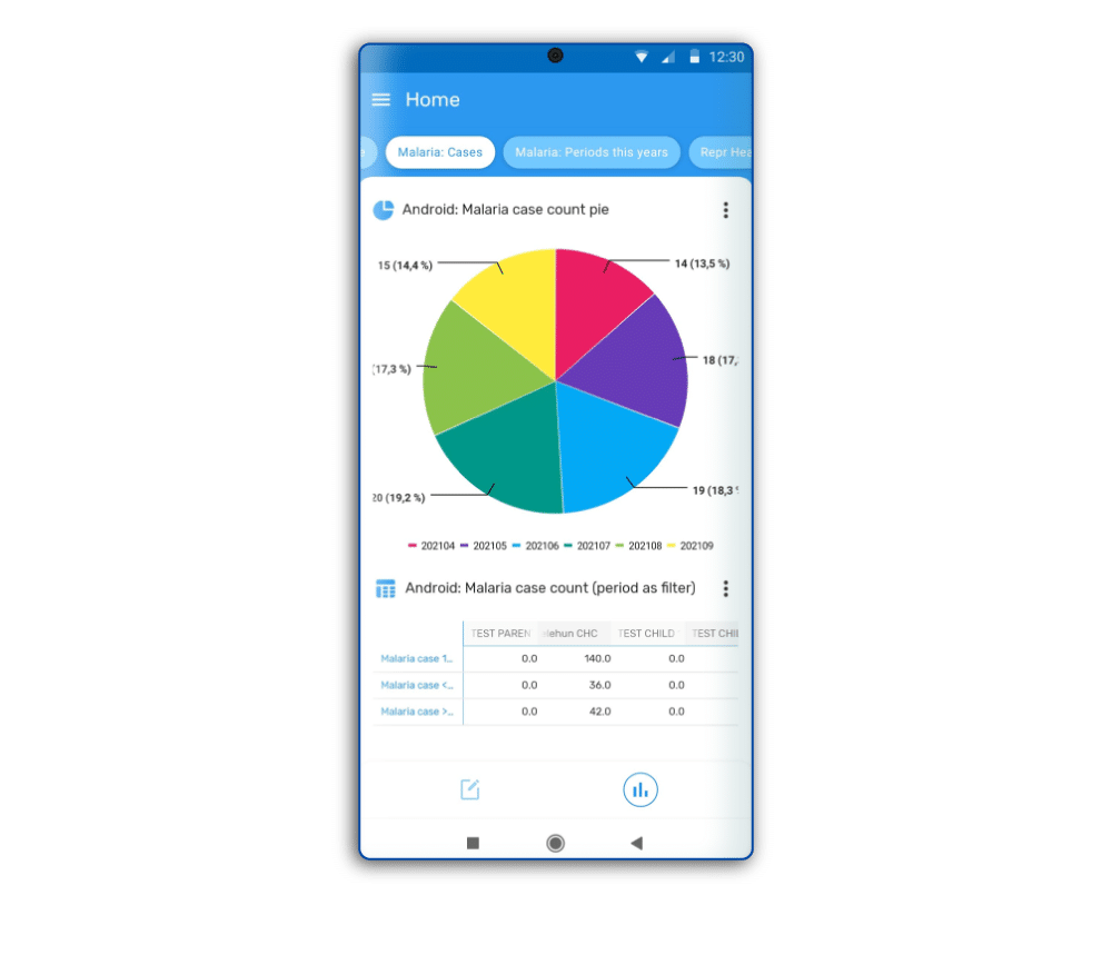
Frontline workers can view real-time analytics directly on their phones or tablets. The DHIS2 Android Capture app lets you share pivot tables, charts, and indicators with end users, where they are updated in the device using local data and are fully functional in offline mode, allowing users to view and analyze data related to their work on the fly. These visualizations can be tailored to the specific context of the end user for different programs, and can incorporate standardized templates, such as the WHO growth monitoring chart for child health programs, helping support best practices and SOPs.
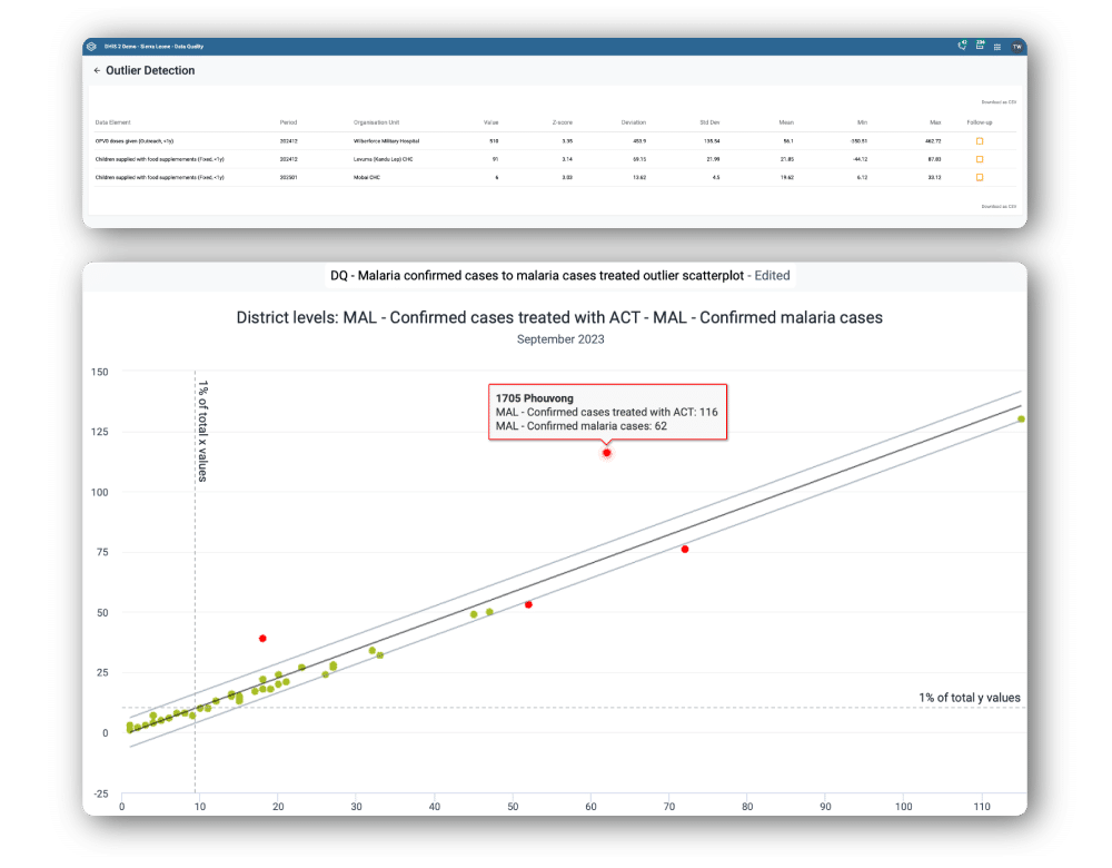
In addition to the functionalities that support data quality during the data collection process, DHIS2 offers several tools to help identify and correct potential data quality issues after collection is complete. With the Reports app, you can easily monitor the completeness and timeliness of reporting submissions and use this to guide supportive supervision and follow up. And with the Data Visualizer app, you can do more advanced data quality checks like outlier detection using Z-score, standard deviation, and min/max limits. Suspicious values can be marked for follow up directly in the app, helping ensure that they are investigated and addressed.
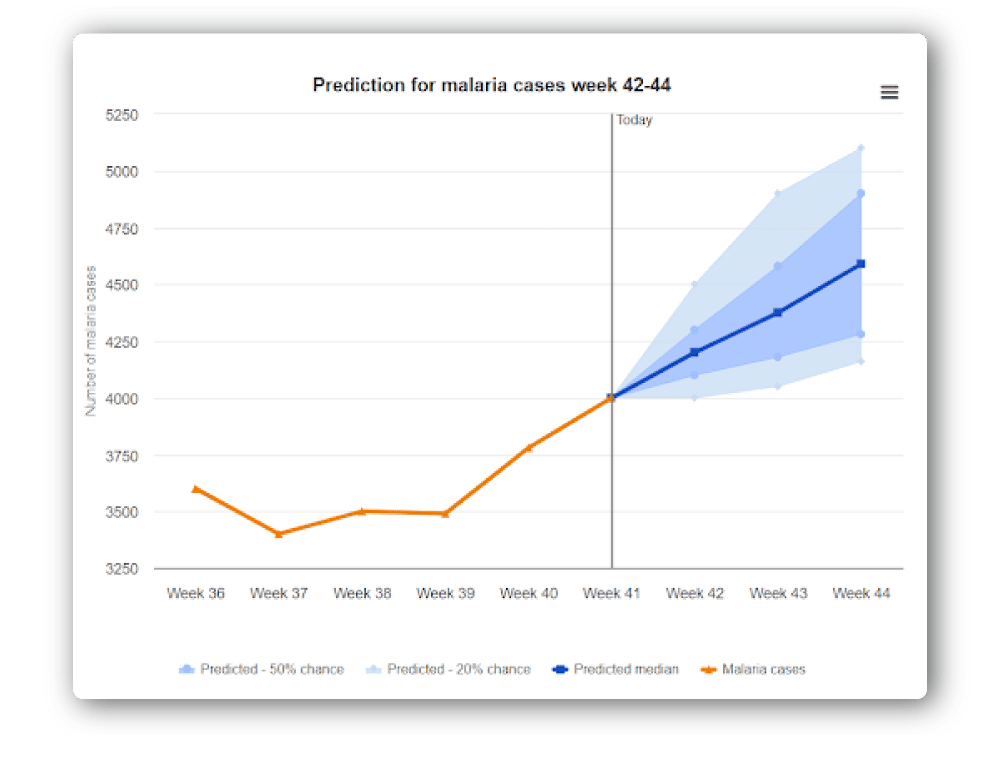
With its ability to bring together structured data from a variety of sources, DHIS2 is an ideal resource for performing combined analysis and triangulation. Now, with the CHAP platform and DHIS2 Prediction app–developed as part of the DHIS2 for Climate & Health project–you can leverage the power of machine learning for predictive modeling and forecasting natively in DHIS2. These tools allow you to train, run, and assess existing models or design your own, and to create DHIS2 visualizations using the model outputs. This makes it possible to display predictions in DHIS2 graphs, charts, and maps, and to use them to trigger automatic notifications, supporting early warning systems and other use cases.
Use the links below to find out more about DHIS2’s built in tools for data analysis, explore new features, read the documentation, and download the latest versions.
The DHIS2 Dashboard app lets you create customized displays of your data visualizations, and allows you to filter and drill down dynamically.
The Data Visualizer allows you to easily create and edit charts, graphs, pivot tables, and other dynamic data visualizations in DHIS2.
The Maps app is a robust and user-friendly tool for working with geographic data in DHIS2 for spatial analysis, including with GIS data from other sources.
With the Line Listing app, you can easily create and filter lists of individual data records, helping get an overview of event data, create working lists, and more.
The Prediction app connects DHIS2 to the CHAP platform for predictive modeling and forecasting of climate-sensitive diseases.
DHIS2 Android Capture app lets end users see pivot tables, charts, and indicators based on the data they have collected, including when they are offline.
Want to get some hands-on experience using DHIS2 for analysis? Check out these free training courses on the DHIS2 Online Academy:
You can also sign up for more advanced in-person courses through the DHIS2 Academy.
DHIS2 lets you have your analytics where you want it. While the DHIS2 platform offers a robust suite of data visualization tools, many users choose to export their DHIS2 data to systems that specialize in complex statistical or GIS analysis, or that offer additional visualization and dashboard options. Some popular analytics platforms that can be used with DHIS2 data are: PowerBI, ArcGIS, Superset, Zenisys, BAO Analytics Platform, Tableau, QGIS, and many more.