The DHIS2 Annual Conference takes place from 15-18 June 2026! Learn more

The DHIS2 Annual Conference takes place from 15-18 June 2026! Learn more
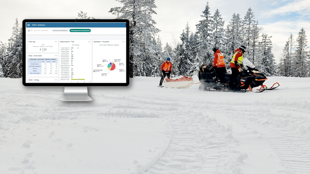
HISP Uganda led a successful redesign of the country’s DHIS2 EPI dashboard, which resulted in significant improvements to user perceptions of its functionality and use, and nearly tripled dashboard usage.
Since 2018, the HISP Centre at the University of Oslo (UiO), the World Health Organization (WHO), and other partners have collaborated to develop DHIS2 toolkits to help countries improve the quality and effective use of integrated health information systems covering a variety of health programs, including tuberculosis, HIV, malaria, and immunization. These toolkits include metadata packages, which offer pre-configured tools for data collection and analysis on the DHIS2 platform, including standardized dashboards designed to facilitate effective data use.
Uganda is one of more than 70 countries that have adopted DHIS2 metadata packages to date. In 2018, the Ministry of Health collaborated with HISP Uganda to install the aggregate immunization metadata package on the national DHIS2 system. The expectation was that this would enhance data analysis on the DHIS2 platform, especially for routine data reported through the HMIS, but there had been limited utilization of these analytic products, with only 78 total views of the immunization dashboard in October 2022 across all 146 districts in Uganda.
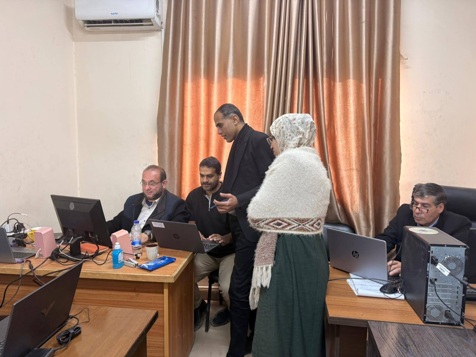
To address this issue, the Ministry of Health’s Expanded Programme on Immunization (EPI) led an effort to revamp the dashboard’s design, using a participatory approach, supported by HISP Uganda and engaging key stakeholders, including district- and facility-level users, and partners like the African Field Epidemiology Network and WHO Uganda. In-country technical assistance and capacity building for DHIS2 is supported by HISP Uganda through Gavi’s technical assistance funding mechanism based on national EPI priorities. Gavi support has also enabled the development and evaluation of the DHIS2 immunization toolkit, including key DHIS2 platform functionalities to improve the use of immunization data. HISP Uganda conducted a baseline assessment, launched the new dashboard that they updated based on user feedback, provided user training, and then conducted a mid-term assessment to measure changes in user perception and system utilization. These efforts resulted in significant improvements to user perceptions of the platform, while the use of the EPI dashboard nearly tripled.
“The EPI dashboards have greatly improved data use for us at the EPI program, as we use them in program performance assessment and presentations to various stakeholders, including partners and grant applications.” Albert Besigye, Monitoring and Evaluation Manager, EPI Program, Uganda Ministry of Health
Reviewing progress since this update in January 2026, the Ugandan EPI team noted continued strong utilization of these dashboards, supported by training for district and health facility users. During this time, the EPI program achieved notable improvements in vaccination coverage, as reflected by the “Reaching Every Child” (REC) indicator. More than 80 of Uganda’s 146 districts now achieved REC Category 1 (>90% coverage and <10% dropout), compared to fewer than 60 districts prior to the dashboard improvements and training. The EPI dashboard has also been actively used to target interventions for zero-dose children, with 50 districts earmarked for closer supervision and monitoring, all guided by dashboard insights.
Before launching the improved tool, HISP Uganda and the HISP Centre designed a baseline assessment to assess user perceptions of the existing tool, specifically, the appropriateness, comprehensiveness, and reliability of the dashboard for routine EPI activities, as well as the accessibility and ease of use, and the training and capacity-building needs, at the district level and facility level. This was sent out to Ugandan EPI system users as an anonymous survey in October 2022.
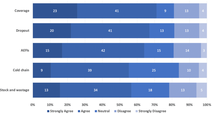
The baseline assessment received a total of 94 responses from system users in nearly half of the nation’s 146 districts, primarily from district biostatisticians. Their responses revealed generally positive perceptions of the original dashboard design, citing broad satisfaction with its use for tracking immunization coverage (71%), dropouts (67%), and adverse effects following immunization (AEFI) (64%). However, responses showed room for improvement on the dashboard’s use for stock wastage and cold chain management (55%). Respondents mostly agreed that the dashboard was easy to access (74%) and learn (73%), and that it provided reliable and timely information (72%), but they were less satisfied with its ease of navigation (68%) and the availability of a user manual (59%). The majority responded that they had received training on the tool (65%), and those who received the training felt that it was adequate (67%). And finally, respondents indicated that they always or often used the dashboard (87%), and that they were able to extract relevant information in less than 15 minutes (82%).
Using the baseline data and the feedback from the participatory design process, the team from HISP Uganda and the HISP Centre identified key improvements to be made to dashboard design and functionality to better meet the needs of EPI users. They also recommended providing routine training for health facility users and advanced training for district-level users, incorporating a robust monitoring and evaluation framework to set benchmarks. In addition, they identified several areas of improvement for the underlying DHIS2 system and infrastructure, including: system stability, performance, and accessibility; data extraction, quality, and analytics tools; and system integration. The team noted that internet connectivity at the district and facility levels must be improved in order to maximize system use and effectiveness, and to increase user confidence in the tool.
Follow-up assessment shows significant improvements in dashboard use and user perceptions
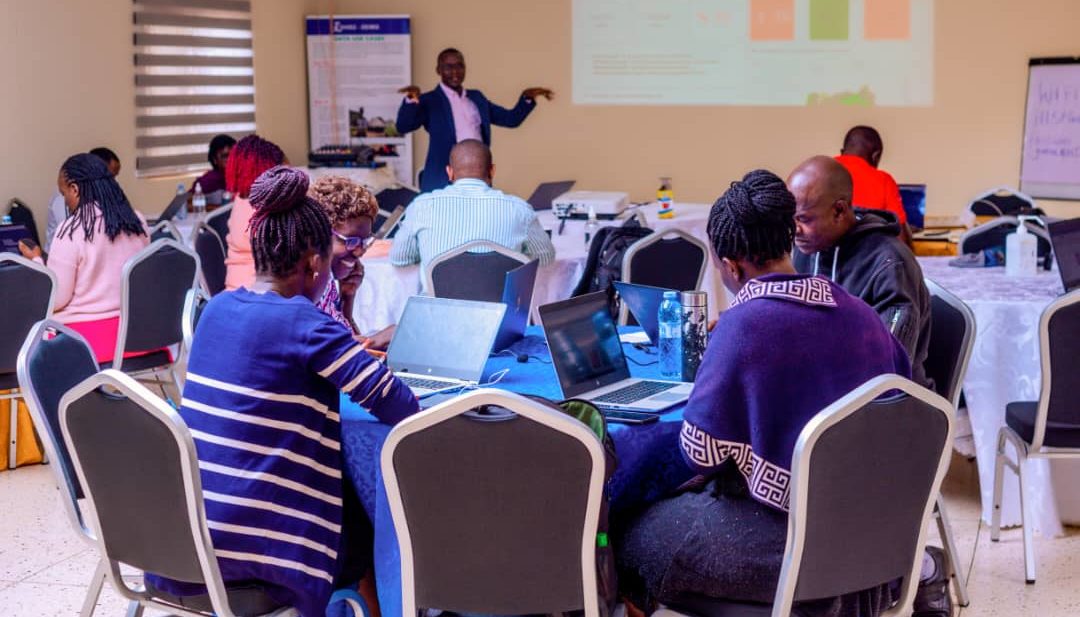
Following the completion of the baseline assessment, HISP Uganda rolled out the revised dashboard to users in October 2022 and then facilitated a series of user training sessions in July 2023 for 457 participants from the nation’s 14 health districts. Next, the team conducted a mid-term assessment in November 2023 to determine how well the redesigned dashboard performed in comparison to the original. The mid-term assessment captured 216 responses—more than double the responses from baseline assessment—which included a majority of the original respondents and enabled a comparative analysis of their perceptions.
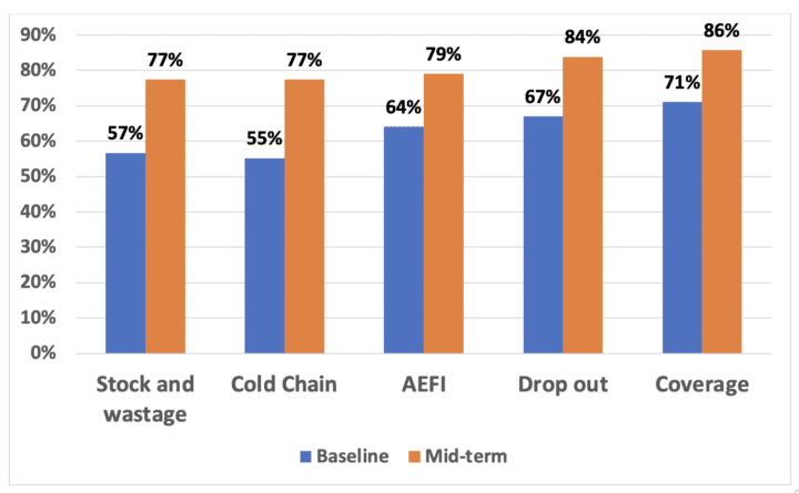
When compared to the baseline, this mid-term assessment revealed key improvements in dashboard appropriateness and comprehensiveness for coverage (from 71% to 86%), dropout (from 67% to 84%), AEFIs (from 64% to 79%), cold chain (from 55% to 77%), and stock and wastage (from 57% to 77%). These results suggest an overall improvement in user perception of DHIS2 as a digital tool, and a positive trajectory in the effectiveness of the dashboard in handling routine immunization data. The mid-term assessment also showed improvements in ease of access (from 74% to 81%), ease of learning (from 73% to 79%), ease of navigation (from 68% to 75%), and the availability of the user manual (from 59% to 81%). These changed perceptions can be credited to a combination of the dashboard redesign and the user training sessions that followed.
Perhaps most importantly, the mid-term assessment showed nearly three times the number of monthly dashboard views compared to the baseline (from 78 to 225), showing more active engagement with the tool, which facilitates improved data use. “Dashboards have eased data access and use for the doctors and nurses within the program,” said Albert Besigye, a monitoring and evaluation manager for the Uganda National EPI program. “The previous methodology was cumbersome as it involved download/extraction [and] analysis of data prior to sharing it for the regions that they supervise. […]Now, all they have to do is log in and filter by the regions they supervise and provide feedback to the districts in those regions.”
Next steps: Improving internet connectivity, ongoing capacity building, and continued engagement with users
While the mid-term assessment showed improvements in the majority of areas, HISP Uganda and the HISP Centre have identified several remaining opportunities for improvement. The largest and most impactful of these is related to internet connectivity across the nation—nearly half of respondents (46%) cited internet connection as a barrier to access. While this is a larger infrastructure issue that extends beyond the scope of the technical assistance that HISP Uganda provides, the results of this assessment can help contribute to advocacy and resource mobilization efforts to address it. “Going forward, of course, we need to make sure that internet connectivity is improved,” said Patrick Omiel Okecho, of HISP Uganda. “This is something that is already ongoing—there are a lot of partnerships to support connectivity at both the district and the facility level.”
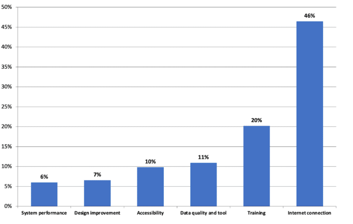
Additionally, users will have a continued need for general DHIS2 training and EPI dashboard training to continue building the skills of existing staff, onboarding of new staff, and to keep up to date on future developments in DHIS2 software and dashboard design. Feedback also indicated a lack of facility-level targets or catchment population data, as well as missing reporting tools for new antigens. In terms of system access, the team identified a lack of user accounts for staff, or accounts with insufficient access rights, as well as a lack of computers and other devices.
HISP Uganda and the HISP Centre have highlighted recommendations to address this feedback, and to ensure continued growth and data use for Uganda’s National EPI dashboard. To improve access and promote dashboard use, they aim to continue soliciting user feedback and refining the dashboard, and to conduct a program impact assessment to document how the use of DHIS2 has enabled improvements in EPI program management. HISP Uganda has also proposed scaling the participatory design approach to other programs like HIV, malaria, or tuberculosis, and to other countries as well, with the goal of achieving similar improvements in data use there.
This article is based on a presentation by Patrick Omiel Okecho of HISP Uganda at the DHIS2 2024 Annual Conference. Watch the recording on YouTube (beginning at 24:13) and view the slides on Google Drive. You can also view Okecho’s abstract on this project in the DHIS2 Community of Practice.